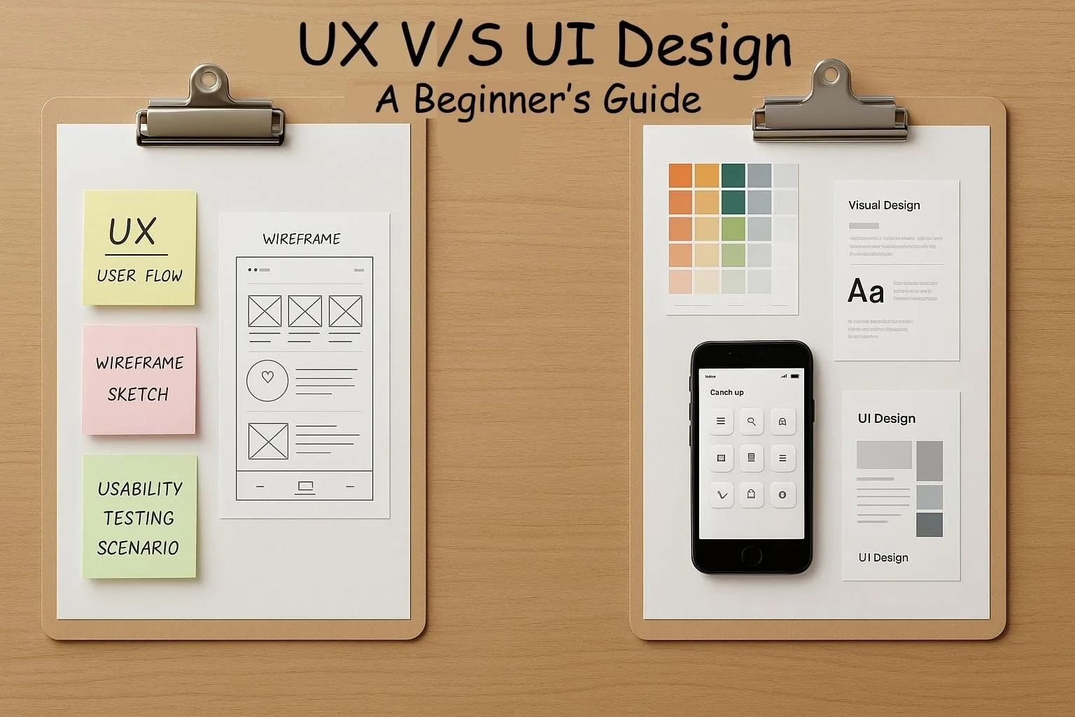
UX (user experience) design decides whether a product works for the people using it. UI (user interface) design decides what they see and touch while they use it.
A simple way to picture it: UX is the route through a building, and UI is the signs, doors and lighting along the way. A beautiful sign on a route that leads nowhere still leaves people lost.
Key takeaways
UX is the whole experience; UI is one part of it. Don Norman and Jakob Nielsen define UX as "all aspects of the end-user's interaction with the company, its services, and its products."
UX work comes first: research, user flows, structure and testing.
UI work makes it usable and recognisable: layout, type, colour, buttons and states.
Accessibility is where both most often fail. WebAIM found low contrast text on 83.9% of the top million home pages in 2026.
Small, frequent tests beat big studies. Nielsen found five users uncover about 85% of usability problems in a test round.
What is UX design?
Nielsen Norman Group's definition of user experience, written by Don Norman and Jakob Nielsen, is deliberately broad: "User experience encompasses all aspects of the end-user's interaction with the company, its services, and its products."
They make the difference from UI clear with an example. A movie review site can have a perfect search interface, but if its database only covers major studio films, someone looking for an independent release still has a poor experience.
UX design answers questions like:
Who uses this, and what are they trying to get done?
What steps do they need to take, and which can be removed?
What information do they need at each step?
Where do people get stuck, confused or give up?
What is UI design?
UI design is the visible, interactive layer: page layouts, typography, colour, icons, buttons, form fields, menus, and how each element responds when someone taps, hovers or makes a mistake.
Good UI makes the right action obvious. It uses consistent patterns so people do not have to relearn the interface on every screen, and it makes sure everyone can read and operate it.
How are UX and UI different?
| Question | UX design | UI design |
|---|---|---|
| Main question | Does this work for the people using it? | Is it clear, usable and consistent to look at and interact with? |
| When it happens | From the start, before anything is visual | Once structure and flows are agreed |
| Typical activities | Interviews, analytics review, user flows, wireframes, usability testing | Visual design, design systems, component states, responsive layouts |
| Typical outputs | Journey maps, sitemaps, wireframes, test findings | Mockups, style guides, component libraries, prototypes |
| How success is measured | Task completion, drop-off, time to complete, support requests | Readability, consistency, accessibility checks, click-through on key actions |
Where do UX and UI overlap?
In practice, most decisions involve both:
| Element | UX decision | UI decision |
|---|---|---|
| Navigation | Which pages exist and how they are grouped | How the menu looks and behaves on each screen size |
| Forms | Which fields are needed at all | Labels, spacing, input types and error styling |
| Buttons | Which action matters most on the page | Which button looks primary and how it reacts |
| Feedback | When people need to know something happened | Loading indicators, success and error messages |
| Accessibility | Whether every task can be completed with a keyboard or screen reader | Contrast, focus styles and text size |
Why do accessibility problems belong to both?
Because they are the most common way good-looking products fail real people. The WebAIM Million 2026 report tested the home pages of the top one million websites and found detectable WCAG failures on 95.9% of them. The most common issues:
- Low contrast text83.9%
- Missing image alternative text53.1%
- Missing form input labels51%
- Empty links46.3%
- Empty buttons30.6%
- Missing document language13.5%
Source: WebAIM Million 2026 report
Low contrast is a UI decision. The W3C's contrast guidance sets a minimum ratio of 4.5:1 for normal text and 3:1 for large text. Missing labels and empty buttons usually start as UX gaps, where nobody decided what a control should be called.
Many of these are fixed with a few lines of markup:
<!-- Before: a screen reader announces "button", with no purpose -->
<button><svg aria-hidden="true">...</svg></button>

<!-- After: the button has a name -->
<button aria-label="Open menu"><svg aria-hidden="true">...</svg></button>

<!-- Before: the placeholder disappears as soon as someone types -->
<input type="email" placeholder="Email" />

<!-- After: a visible label that stays -->
<label for="email">Email address</label>
<input id="email" type="email" autocomplete="email" />
How do you test UX without a big budget?
Test with a handful of real users, fix what you find, and test again. Jakob Nielsen's research on test sizes found that "the best results come from testing no more than 5 users and running as many small tests as you can afford." A first round with five participants found about 85% of the usability problems.
A lightweight test plan:
Pick three tasks that matter to the business, such as finding a service, requesting a quote or completing checkout.
Recruit five people who match your real customers, not colleagues.
Ask them to think aloud while they try each task. Do not help.
Note where they hesitate, misread or give up.
Fix the biggest problems, then repeat with five new people.
How does UX and UI work look on a real website project?
On the websites we build, UX and UI are the same project, not a relay between two teams. We map what visitors need first, such as services, locations and proof, then design the interface around those journeys.
For VIP Plumbing, that meant a new WordPress site built around service and location pages people search for, alongside Google Business Profile work. Organic traffic grew by 500%. Across 53 web builds, the pattern holds: structure and clarity usually matter more than decoration.
Should you hire a UX designer, a UI designer or both?
| Your situation | What you need |
|---|---|
| Small business website | One designer or agency covering both, with UX research kept lightweight |
| Redesign because conversions are poor | UX first: analytics, testing, then interface changes |
| Product with complex workflows | Dedicated UX research and design, plus UI and a design system |
| Established product that looks inconsistent | UI and design system work |
If your site already ranks but visitors are not converting, UX is often the problem. We cover common causes in why conversion rates drop when rankings look fine. For help with a new site or redesign, see our website and ecommerce builds or talk to us.
Frequently asked questions
Are UX and UI the same thing?
No. UX covers the whole experience of using a product or service. UI is the visual and interactive layer people use to get there. UI is part of UX.
Which should a beginner learn first?
Learn the basics of both. Many beginners start with UI because it is visible, but understanding user research and flows early will make your interface work much stronger.
Do UX and UI designers need to code?
Not necessarily, but knowing basic HTML and CSS helps you design things that can be built, and makes it easier to work with developers on accessibility.
Can one person do both UX and UI?
Yes. Many product and web designers do both, especially at smaller companies. Larger teams often split them as projects grow more complex.